From A to B and Back Again
UX notes on planning the interactions of state transitions and scrolling behaviors
Juan Flores Mena
Product Design & Prototyping
@72mena
I wrote this analysis in 2016 and was picked and published by the Framer team on their Medium blog.
A common challenge when designing digital products, specially when creating design deliverables, is having to explain an app flow, a transition between two screens, or even a change between two or more states in the same screen.
A designer’s skill to imagine these transitions is almost as valuable as the skill required to explain them, to create a visual representation that will help maintain one same vision for the product among different teams (Design, PMs, Development, etc).
Static deliverables, like wireframes, comps, app flows in PDFs, etc. help to communicate the visual side of the product. But motion, behaviors and interactions shouldn’t be left open to interpretation. And just sending an MP4 file to the dev team doesn’t really help as you’d expect.
It’s common to see design deliverables with flows that show, let’s say, a screen with “state A” and then a slightly different “state B”. But designers need to plan for more than just A and B, as there’s a bigger need to envision, deliver and communicate the expected transition of going from A to B and back again.
From A to B
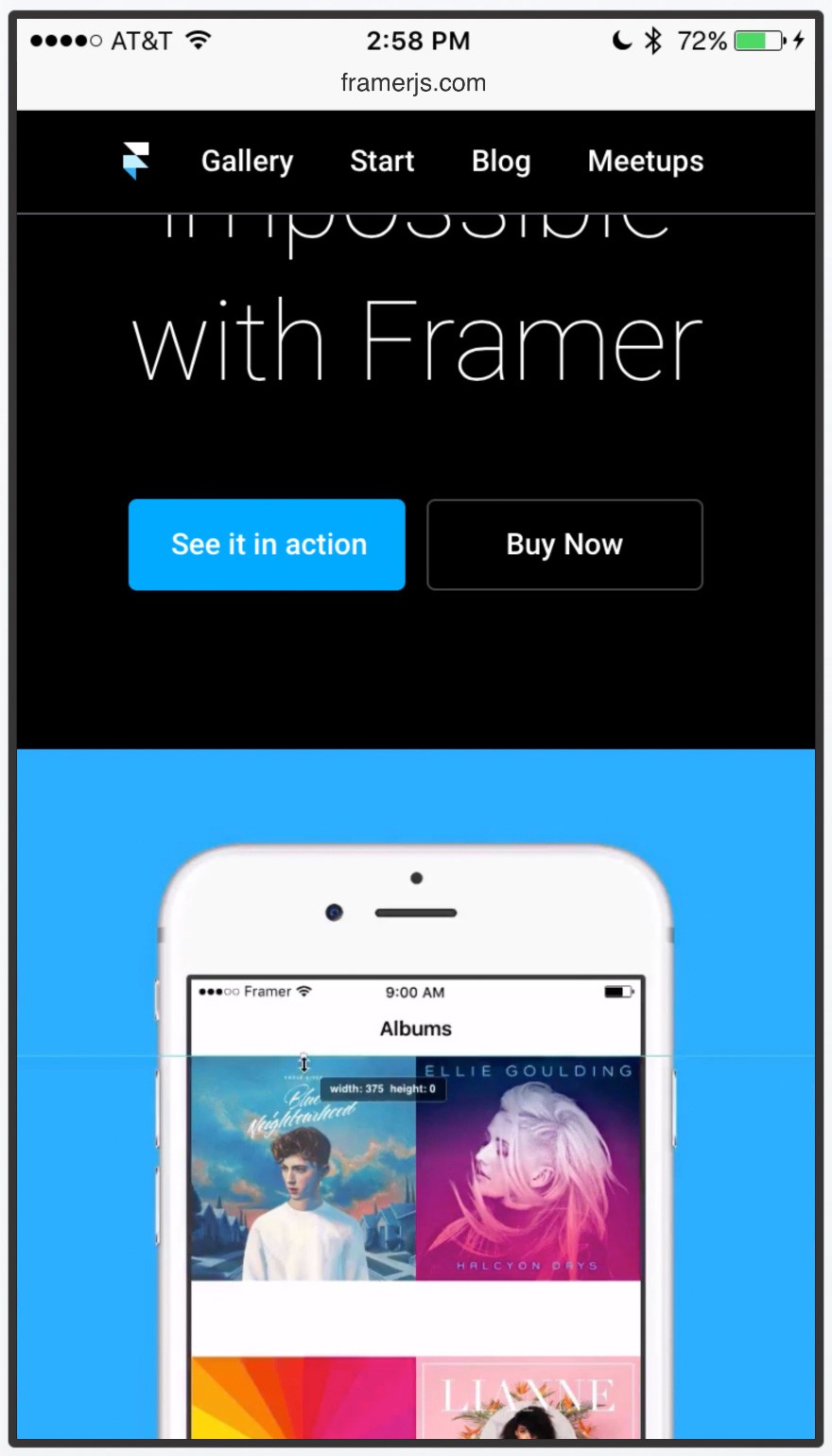
This is what we’ll be discussing here: scrolling through a website and how the browser’s UI, suggested app banner and top menu react to the scroll.
State A: Top scroll position.
State B: Scrolled content.
Option One: No special scrolling behaviors
This is a very simple implementation of a scrolling behavior. Nothing special going on here; if this is what we need to communicate with a prototype, then I’d recommend using InVision, as it is super easy to use and you get low-fi interactions done in almost no time.
Things to notice:
Browser UIThe browser’s header doesn’t react to the scroll.
The tab bar (bottom menu) doesn’t react to the scroll.
ContentAll the content is just one big piece apart from the browser UI. It simply moves along with the scroll.
The top banner (which I’ll call the suggested app banner) and the top menu do not have special behaviors. These just move along with all the content.
Notice how if I overdrag the scroll from the top both the suggested app and the menu continue to scroll along, showing a gap between the browser’s header and the suggested app.
Option Two: Top Menu as a sticky header
The suggest app may not be crucial for the rest of the content. However, the top menu is important, so for this option we’ll keep it visible at all times as a sticky header.
Things to notice:
Browser UISame as Option 1, the browser’s header doesn’t react to the scroll.
Also same as Option 1, the tab bar (bottom menu) doesn’t react to the scroll.
ContentKeeping the top menu visible at all times is a subtle but very important change in the scrolling behavior when compared against option 1.
If we only think in terms of “A” and “B”, we wouldn’t have an answer for this question: What happens if I scroll back? Should the suggested app appear again? How would that work?
What the prototype is helping communicate here is the behavior of the suggested app and the top menu when the user is scrolling back and forth.
The suggested app banner is not crucial for the content, so we only bring it back when the user scrolls back all the way to the top.
Just imagine having a png for state A and another png for state B, and then having to do all this extra explanation to your teammates. Having a prototype helps immensely and makes meetings shorter. Specially for cases like the next one.
Option Three: Top Menu as a sticky header + Header and Tab Bar react to scrolling.
It’s clear that our content, not the browser’s UI, is what’s important for the user. So we’ll now explore hiding the UI when the user scrolls to read more, and we’ll bring it back if they scroll back.
Things to notice:
Browser UIThe header hides its extra UI leaving only the url visible, and it also scales its size a bit to give more screen space to the content.
The tab bar also reacts to the scroll and it uses the scrolling value to move along with the same rate of speed; it’s also reacting to the direction of the scroll, so it either scrolls offscreen or it comes back.
ContentThere’s a subtle connection between the browser’s header behavior and the top menu. As I mentioned in Option 2, the prototype helps a lot to communicate what happens “From A to B”. I could do a long explanation here, but instead I’ll just point out what I want you to notice in the prototype:
The top menu continues to be a sticky header, however, because the browser’s header is now “listening” to the scroll, and it’s changing its size depending on the scroll, the top menu needs to also react to those changes so it can continue to be a sticky header. Check it out.
This is one of those things that it’s very difficult to explain without a video, so use After Effects if that’s effective for you, as this goes with the “Show, don’t tell” technique. However, the unrivaled advantage of a prototype is that you can pass along a phone so everyone can try it. It’s not only “Show”, it’s “Use it, try it for yourself”.
Here’s a layered-isometric visualization of the assets used for the prototype and how they move in the space without masks or the device around it. This is a great way to share and analyze the prototype with your design peers. Thanks to Fran Pérez for sharing the Perspective View module.
Conclusion
High-fidelity prototypes are great to move the conversation forward and to make sure everyone on the team is on the same page. However, one of the trickiest steps of building digital products is the communication between designers and developers.
I could talk about this topic for hours (tons of paragraphs?) as it is something I’m constantly thinking about, but for now I’ll just share a brief piece of advice:
There are a lot of new tools that help us to keep track of requirements, issues, change requests, design assets, redlines, etc. (and again, this is a big topic and I don’t want to oversimplify it) but in this search for efficiency and writing less documentation, I’d caution you not to leave the dev team out of the loop by just relying on these tools as a middleman between your teams.
Beware of this misconception: when I say these prototypes help us make meetings shorter, or to explain things faster, I mean just that. A prototype is not a glorified video file that you can just send to the dev team and leave it up to them to figure out what’s going on in these from A to B transitions. Less documentation is OK, but not less communication.