Android & iOS Keyboard Experiences
Brief usability notes of a recent experience: coming back to iOS.
Juan Flores Mena
Product Design & Prototyping
@72mena
I wrote this analysis in 2016. Many of the observations may have been addressed already by the evolution of iOS and Android. I'm leaving it as is to have a reference of how the keyboard on these OSs used to be.
I left iOS a bit after iOS7 was announced. I moved to Android and experienced the evolution of KitKat and Lollipop on my Nexus 5.
Out of curiosity, and now that the OS has been greatly improved, I decided to get into iOS again and bought an iPhone 6. I've been using it as my main phone and there are two areas in which I find myself struggling a lot: navigation and keyboards; this post is about the later.
I often jump between 3 keyboard languages: Spanish, English and Japanese. And before today, I didn't really pay attention to the way I used to type on Android, but it's clear to me that it was easier compared to doing it on iOS.
The app I used for these comparisons is Evernote.
Keyboard Layout
Right from start we can see Android's keyboard is cleaner. But if we take a moment to better analyze what's going on here, we'll notice something more important: Android's keyboard has less visual weight, and offers more features.
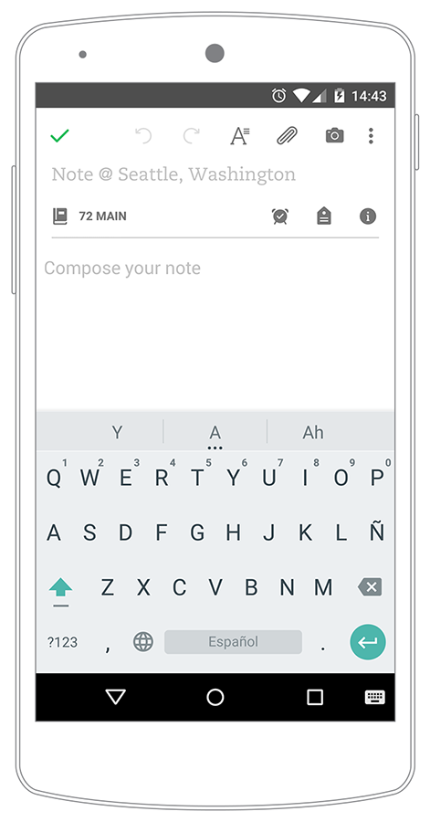
Android
- Direct access to comma and dot.
- Quick access to numbers (hold and swipe).
- No buttons metaphor.
- Accent color for Shift and Return.
- Extra option to change language (keyboard icon).
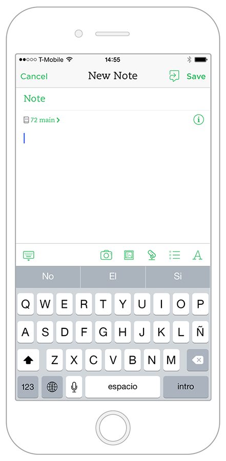
iOS
- Extra step to access comma, dot and numbers.
- Heavier visual weight.
- Space feels a bit cramped.
- Direct access to speech recognition (and it's pretty good, works great with spanish and japanese)*.
Changing Keyboards
There's a big difference in the way both OSs handle showing a list of previously activated keyboards. Both are good solutions with different features, so there's no easy way to decide who did it best. It's more about which one works better for you.
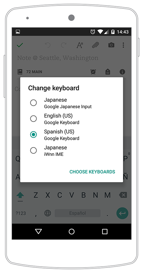
Android
- List inside a modal window.
- Languages appear in English. (ie. "Japanese")
- Extra line of informantion about the keyboard.
- Extra option to add/choose keyboards.
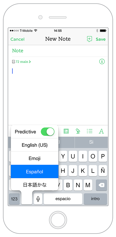
iOS
- List in a contextual flyout, right where your finger is holding the globe icon.
- Languages appear in their language (ie. 日本語).
- Extra option to turn on/off Predictive text.
Predictive Text
Android has a great feature for predictive text: you can access a big list of suggestions just by tapping the 3-dot icon below the central prediction.
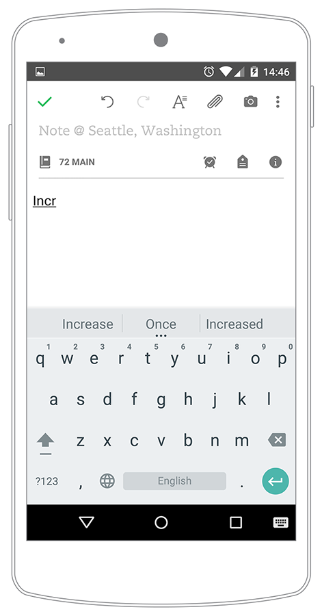
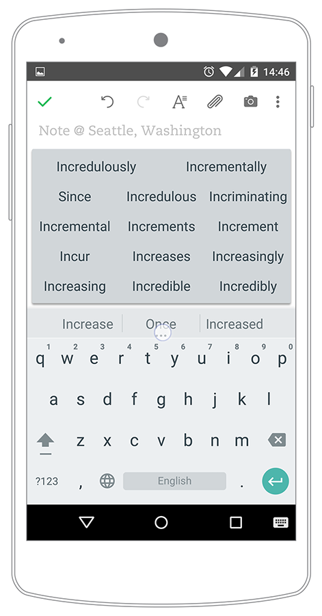
I typed "Incr", note how the first prediction is "Once", and that's good, but I was going to write something quite different. Without adding more characters, by tapping the 3-dot icon I can see that the full list includes the one word I was going to type: "Incrementally".
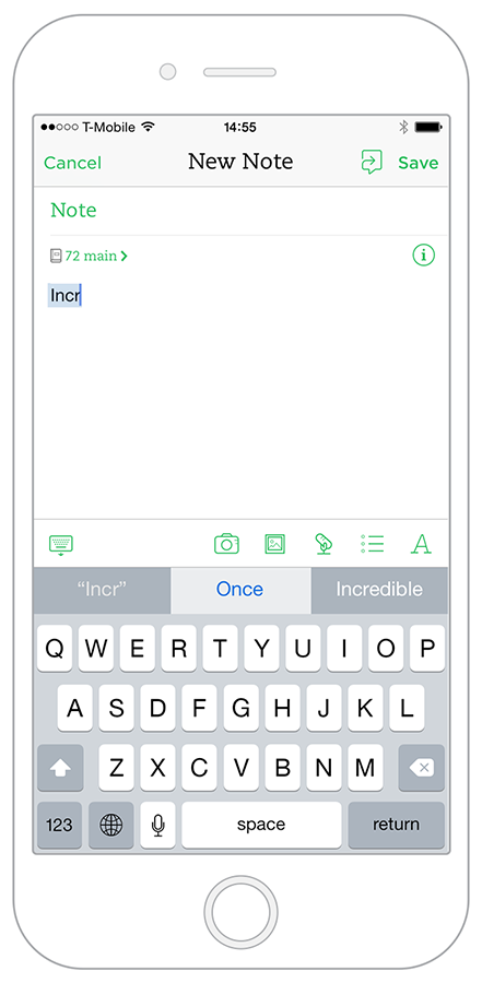
On iOS two things can happen: it either predicts the word I'm about to finish writing (my iPhone found "Incrementally" until "Incrementa"), or I ignore the feature completely and just finish writing the word by myself.
The second option, to ignore predictive text, might not seem like a big deal for iPhone users who only use one language/keyboard. But that's exactly the point here: having features like Android's 3-dot icon is important for users who appreciate small details that add big value to the way they work&write; while jumping between keyboards.
Typing Japanese
You don't need to speak/write Japanese to appreciate this section. There are design and usability lessons to be learned just by observing, understanding and comparing solutions.
Superbrief context on how the Hiragana alphabet works (to better grasp the design challenge that represents translate it to a mobile keyboard):
There are different combinations of consonant-vowels that one has to learn in order to write Hiragana. For western japanese language students, they explain it like this:
Consonant (N) + vowel = Na / Ni / Nu / Ne / No - Hiragana = な に ぬ ね の.
Consonant (T) + vowel = Ta / Chi* / Tsu* / Te / To - Hiragana = た ち つ て と.
And so on...
Ok, so how to present this in a mobile keyboard? A common solution is to show the combinations with the vowel "a" as parents (Na, Ta, Ma, Sa, and so on), each one of those enclosing their combinations with other vowels as their children.
Android
In Android this is pretty clear. You have each one of those 10 "parents", and each one contains its 4 children (the 4 remaining vowels, with some exceptions).
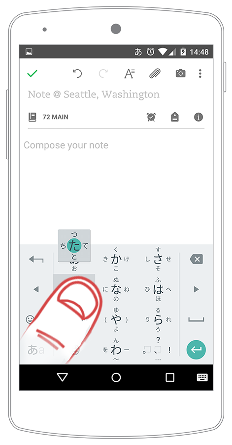
Using hold/swipe interactions, users can quickly access the character they want to type. And something really cool is that in Android a small flyout appears, as a visual guide on where to swipe: up, left, down or right from where your thumb is.
Also, notice the arrows to move your cursor between characters; that's a really nice plus in this keyboard.
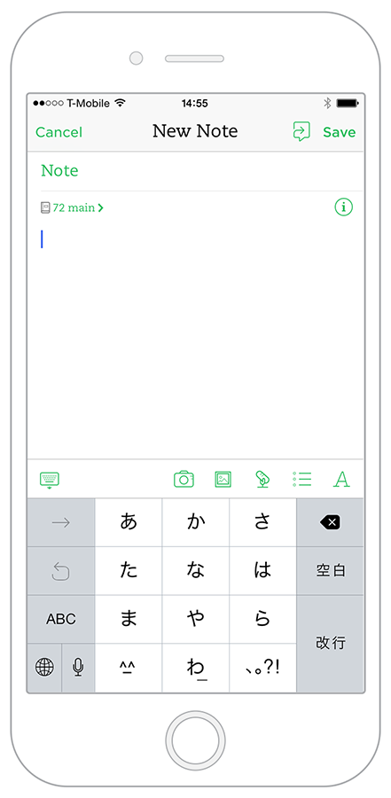
iOS
iOS demands much more from the user. Just by looking at the keyboard one can see that this is not for beginners: there are no hints on where to find a character. The keyboard only shows the "parents" (Consonant + vowel "a") and assumes the user is able to deduce how to get to every other combination. Students in a upper-beginner/intermediate level could find their way, but not without struggles.
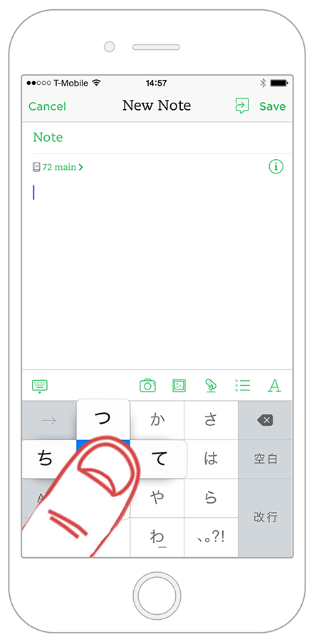
The other thing that I'm missing from Android here is the helpful flyout: as we can see iOS works under the same hold/swipe interaction, but when you hold a character, your thumb ends up getting in the way! You can only see 3 options out of 5.
Also, this keyboard might benefit by having cursor-arrows just like the ones on Android. Is one of those small details that end up having a huge impact.
Conclusion
We take keyboards for granted. When I came back to iOS I noticed my experience with the device was being one of small struggles, but I couldn't pinpoint the reason. It wasn't the "iOS version" of Evernote, Twitter, WhatsApp, Instagram, etc. It was deeper than that. It was iOS' dated navigation/keyboard synergy.
On the other hand, iOS just works, is intuitive, is most people's choice. So what's wrong?
I think the key here is this: By being open to use Android and going through its evolution from KitKat to Lollipop, gave me perspective on what mobile experiences can be. That might sound vague, but now that I came back to iOS I'm living it first hand. I use iOS and I'm constantly finding how different interactions could be improved.
Questions like "Does this mean Android is better?" would open trivial discussions that lead nowhere. So, regardless of OS, I'm more interested in questions like:
- How is the overall experience of my app affected by keyboard interactions?
- Which areas of my app rely heavily on user's input? Can I change those interactions to make them simpler?
- Is my team addressing the product internationalization correctly? What are we taking for granted?
- How should I approach usability testing for a market that is prominently bilingual?
Much of this post might not click with people who are married to one OS, or that never need more than one language. But as I said in the "Typing Japanese" section: one doesn't necessarily need to speak different languages in order to make observations and take notes for wider understanding on sophisticated design solutions, which is how I would describe Android's Japanese keyboard, Predictive Text and main layout.