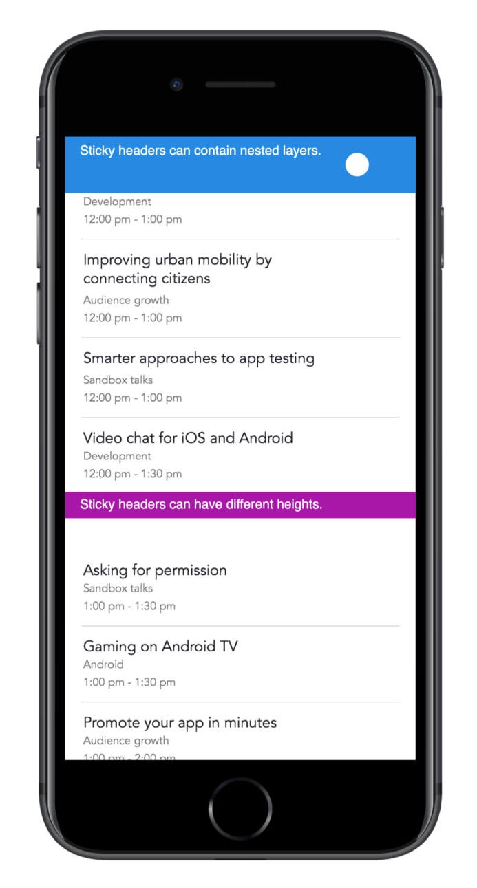
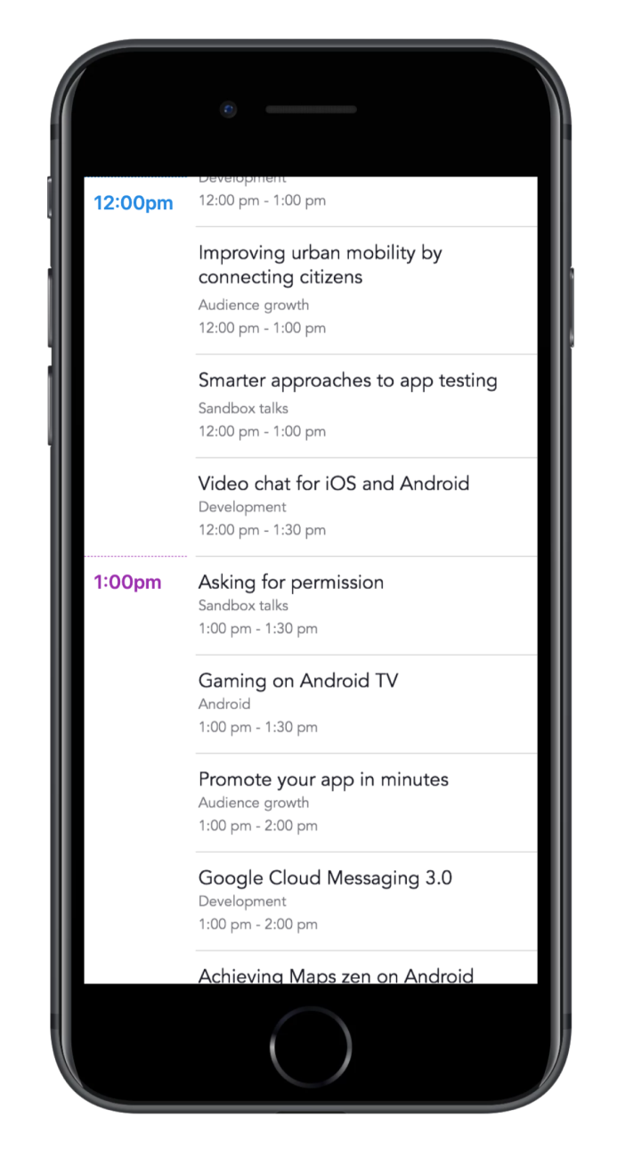
Module: Sticky Headers
A module to handle sticky headers within scroll components in Framer
Design Problem
Generally speaking, designing and prototyping scrolling behaviors is a challenge, and “sticky headers” are particularly tricky.
Even though some tools offer a way to prototype sticky elements, most interaction designers struggle going beyond the limited features offered by their tools.
Not being able to put this interaction together hinders the designer’s capability to visualize, test, and iterate on the desired experience of this interaction.
My Solution
In order to extend the basic functionality of scrolling behaviors, I designed and published a module based on FramerJS that let’s designers and prototypers quickly setup a scrolling behavior that handles multiple sticky headers.
Here are two prototypes to demo the module:
Advanced Scrolling Behaviors
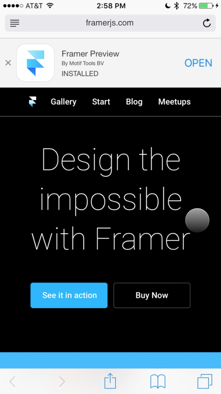
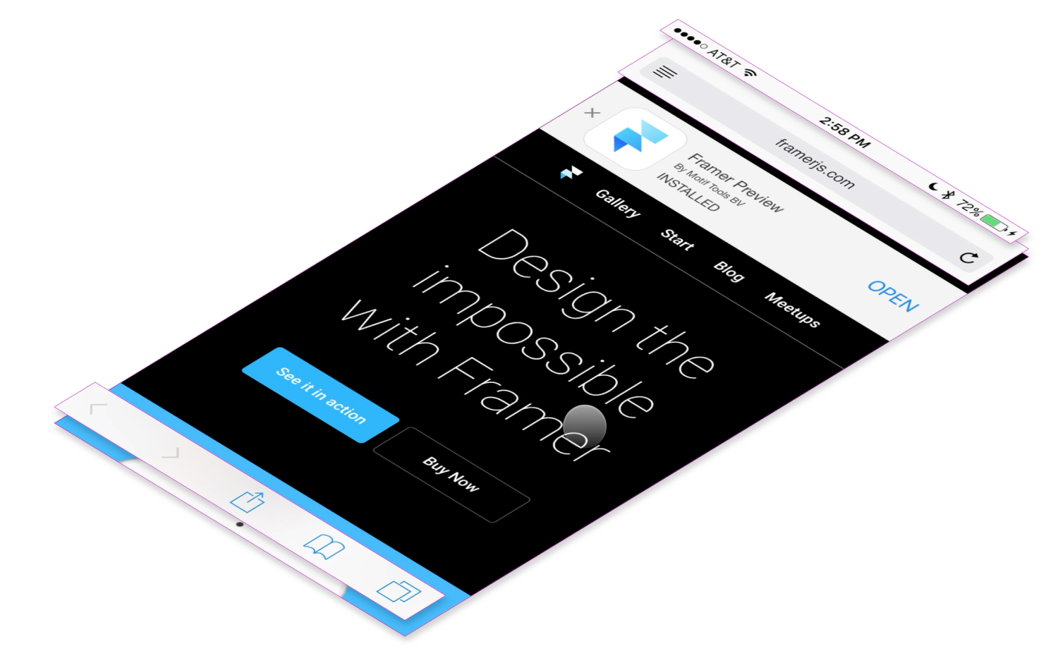
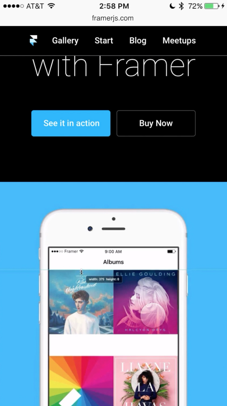
Taking this module to the next level, I looked for ways to combine multiple outcomes from one single scrolling interaction. An example of this is how Safari handles scrolling on mobile. I wanted to replicate the multiple behaviors affected by scrolling through a website's content, which in the following example you'll notice these elements are: the browser UI, the "suggested app" banner and the website's top nav menu.
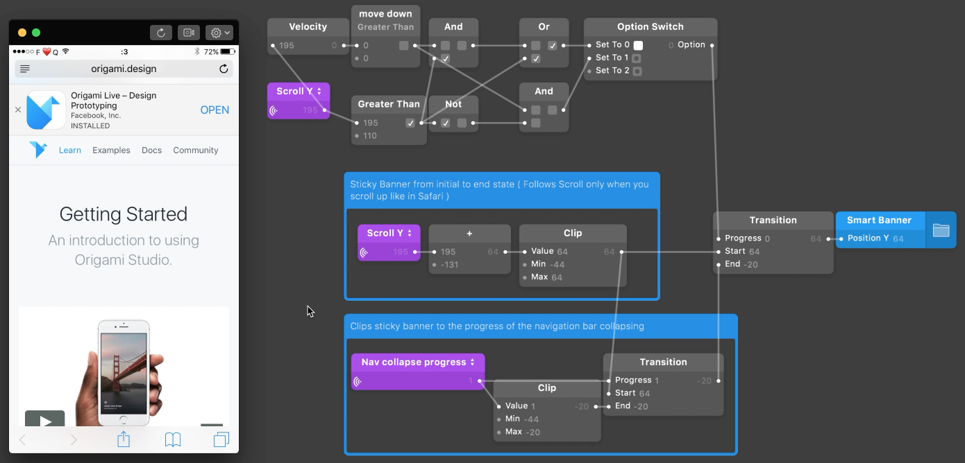
I like to do my research on how other tools would solve specific design challenges. In some cases, some tools fall short of managing a real solution. But in this case I found a great example made in Origami Studio by Geaorge Otsubo. In the image above you can see how the different nodes are connected to provide the expected result. The project is quite complex, but it works.
I managed to bring the solution to Framer, and hide all the complexity in a Class, so this could be easily brought into a project by anyone and implemented through a simpler interface.
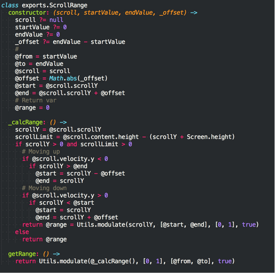
From A to B
I wrote an article that details the thinking behind this solution, and it got picked by the Framer team for their Medium blog.
The next images show the State A (default state) of a website viewed on Safari, and the State B (scrolled state). Next to them are a special layered perspective view to demostrate how all the elements are stacked.

Make sure to check the video of the perspective view, and the prototype.
