The UX of Mobile Settings
A brief analysis of the setting screens on iOS8, Android KitKat & Windows Phone 8.1
Juan Flores Mena
Product Design & Prototyping
@72mena
I wrote this analysis way back in 2014. This article was translated to Chinese by 胡太狼.
Although the OS described here are outdated by today's standards, I thought it would be interesting to bring this article back and be reminded of how things used to be when we had 3 mobile platforms.
We love to analyze and read about good UX. It's common practice to pick an app, redesign a few screens without any constrains and then share the result in Dribbble. However, more often than not, business requirements in real projects and client's platform-constrains tend to be so complex that you end up struggling to come up with an intuitive interface.
Maybe that's why not many articles out there talk about complex projects like real dashboards for Business Intelligence, or platforms' settings that display a big set of nested options. This might not be as complicated as that, but I wanted to take a moment to compare the difference in experiences among Apple, Google and Microsoft device settings.
We love to analyze and write/read about good UX. It's common practice to pick an app, redesign a few screens without any constrains and then share the result in Dribbble. However, more often than not, business requirements in real projects and client's platform-constrains tend to be so complex that you end up struggling to come up with an intuitive interface.
Screen Space Used By Persistent Menus
Since persistent menus are tied to the native UI of their respective OS, this section focus on comparing the difference of free canvas each design language provides, that is, the remaining space for the user to move through the settings.
iOS
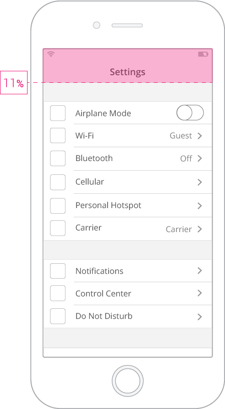
Using only 11% of screen space, the clever use of iOS Persistent Menu + Home button is the cleaner solution among the three OS.
Something worth noting is that Apple leads by example; the vast majority of iOS third party developers have been creating great experiences by applying correctly the Menu + Home button combo.
Android
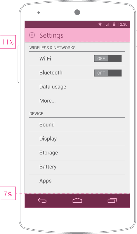
Contrary to iOS, by not having a physical Home button, Android devices must rely in that extra 7% of screen space at the bottom, which totals 18% of screen space used by Persistent Menus.
In version 4.4 (KitKat), Android introduced a 'full screen' mode for apps. This works as it sounds: both of your Persistent Menus hide, and you can bring them back by touching the screen (called the 'Lean Back' mode) or by swiping from any edge to bring back the bars (called the 'Immersive' mode).
The only reason keeping this approach from being the best among the three OS (because it totally is the best) is Android's user base fragmentation. This is only a temporary issue; hiding the system menus will surely become the new standard.
Windows Phone
Contrary to iOS, by not having a physical Home button, Android devices must rely in that extra 7% of screen space at the bottom, which totals 18% of screen space used by Persistent Menus.
In version 4.4 (KitKat), Android introduced a 'full screen' mode for apps. This works as it sounds: both of your Persistent Menus hide, and you can bring them back by touching the screen (called the 'Lean Back' mode) or by swiping from any edge to bring back the bars (called the 'Immersive' mode).
The only reason keeping this approach from being the best among the three OS (because it totally is the best) is Android's user base fragmentation. This is only a temporary issue; hiding the system menus will surely become the new standard.
Settings Screen Length
Since persistent menus are tied to the native UI of their respective OS, this section focus on comparing the difference of free canvas each design language provides, that is, the remaining space for the user to move through the settings.
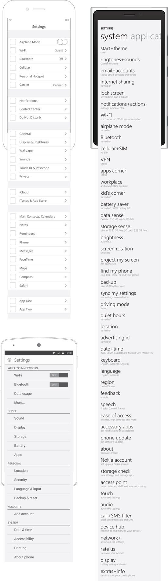
Windows Phone
Let's talk about WP first.
The settings are just thrown there in an endless list that doesn't follow a particular order. Good luck trying to quickly find keyboard options, or getting the difference between 'about' and 'extras+info'.
I'm intrigued about this seemingly unordered list and the design thinking that went behind it. This demands a lot from the user. I consider an error to force the user learn the precise location of a particular setting in such a painful way.
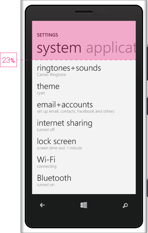
The list is longer than iOS and Android combined. And keep in mind the 23% of screen space used by the persistent menu. Again, this design language will definitely change soon.
iOS
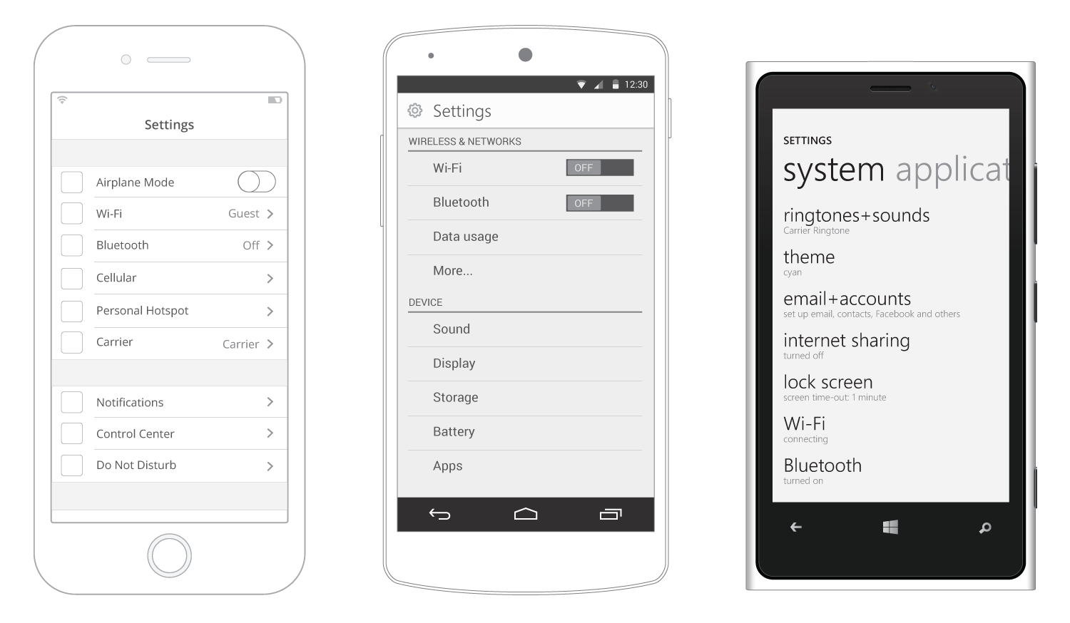
By using just slight contrasts in the UI, the settings list in iOS ends up being nicely grouped.
The user can quickly perceive the difference among group sets and better form a mental path to any particular setting he often changes. Evenmore, icons (wireframe shows placeholders) greatly improve the fast identification of a setting.
Android
The concept of grouping the settings list into smaller sets is different here than in iOS.
Instead of using tone-contrasts like in iOS, Android presents a bit of contrast in line weights, preceded by a really useful label to define what the set of settings is about. (Also, icons in each setting, not showed in the wireframe)
One might say that iOS grouping by tones, without labels, is enough. But the most common user is, ironically, not that tech-savvy. Labels represent a quick and precise way to quickly identify what the set is about.
I consider Android's approach to be the best in the current state of these mobile OS. However, Android should change its dark-colored theme. iOS feels much more welcoming using light tones.
Content Ordering
Which process did Apple, Google and Microsoft apply for ordering their mobile settings? Which one would you apply if you were assigned this task? For the sake of comparison (and since Android presents the best ordered list), I decided to use Android's 5 categories and, from a card-sorting approach, better grasp the arragement of settings in iOS and Windows Phone.
Refer to this list of categories to identify the group a setting belongs to:
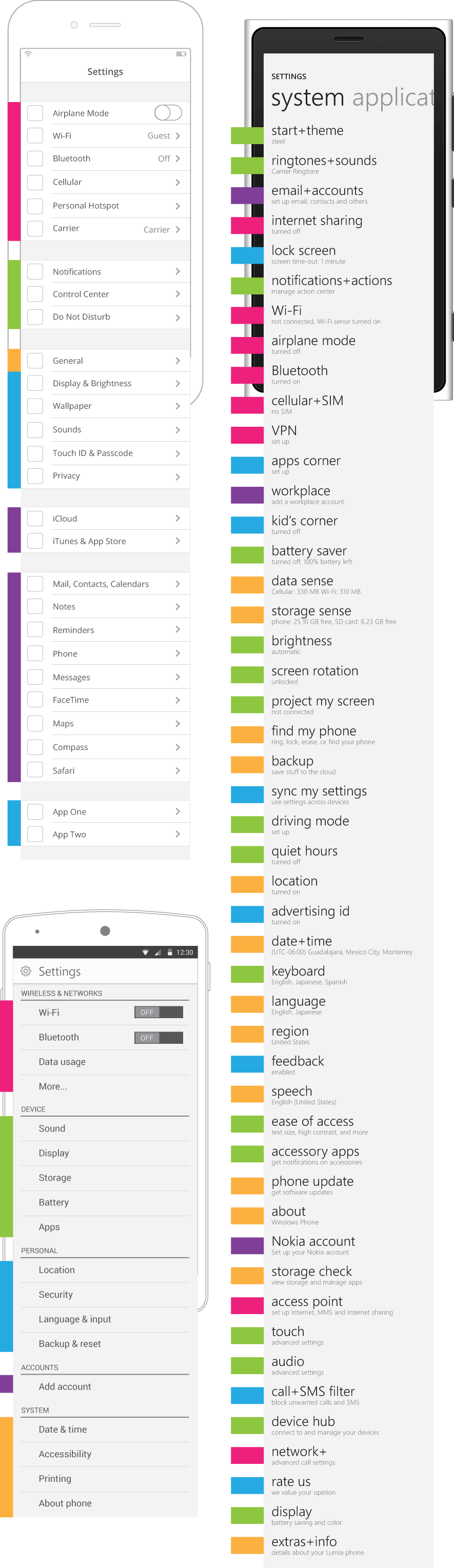
Android is the standard by which others are measured here. It has the best settings categorization. I'm sure this is due to the exhaustive user testing process every Google project goes through.
Even without using labels, iOS ordering is cohesive and easy to follow. As we can see by the colored cards, there's a good and balanced distribution of settings, making it easy for the user to scan through them.
Windows Phone, once again, it's difficult to understand. Settings are so mixed, without a sense of good distribution nor balance among its categories, that the user easily ends up confused. The user is forced to slowly scan through each option in order to find what he's looking for. Honestly, this appears to never have been tested.
Conclusion
This brief analysis covered only the first level of settings a user encounters in their device. We can grasp much of these OS settings experience by observing and comparing their available screen space, the length of the settings list and the ordering of its options.
One could argue that one of Windows Phone strenghts is that there are not many sub-levels as in iOS or Android. However, something crucial is to engage the user from start, and help him quickly find what he's looking for. Right now, Windows Phone is well behind the goal, relying too much in users' ability to adapt to a complex, unordered system.
iOS and Android are the big, leading OS. Each one constantly outdoing the other. In the current state of UX, iOS is the most easy-to-use, where Android empowers users the most.
However, and these screens are a good example of it, Android is on track to have the best UI (Lollipop), and to become the leading experience in mobile.
At the end of the day, the mobile experience as a whole is a project Apple, Google and Microsoft are building together, and its crucial they have different approaches to it.